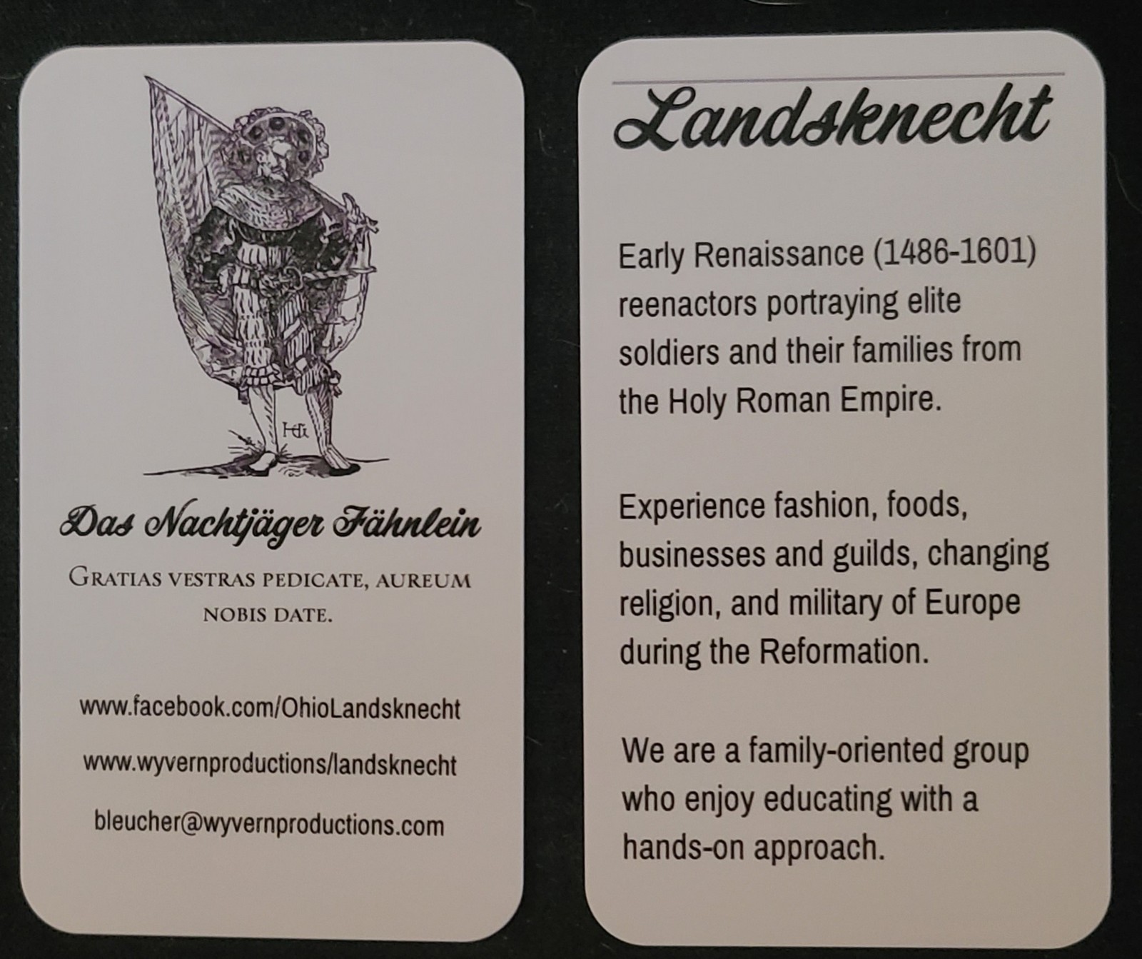
After a long wait, we've finally gotten new business cards. While keeping the same flavor, we've added a few features that we really like. First, we changed the orientation of the card. I mean, we have really long pikes, so why shouldn't our cards be taller than they are wide? Second, instead of just the unit name, motto, and contact information, we added a back that describes a little of what we represent. To add some style, we beveled the card edges and the front has a raised, glossy finish. We're pleased. What do you think?

